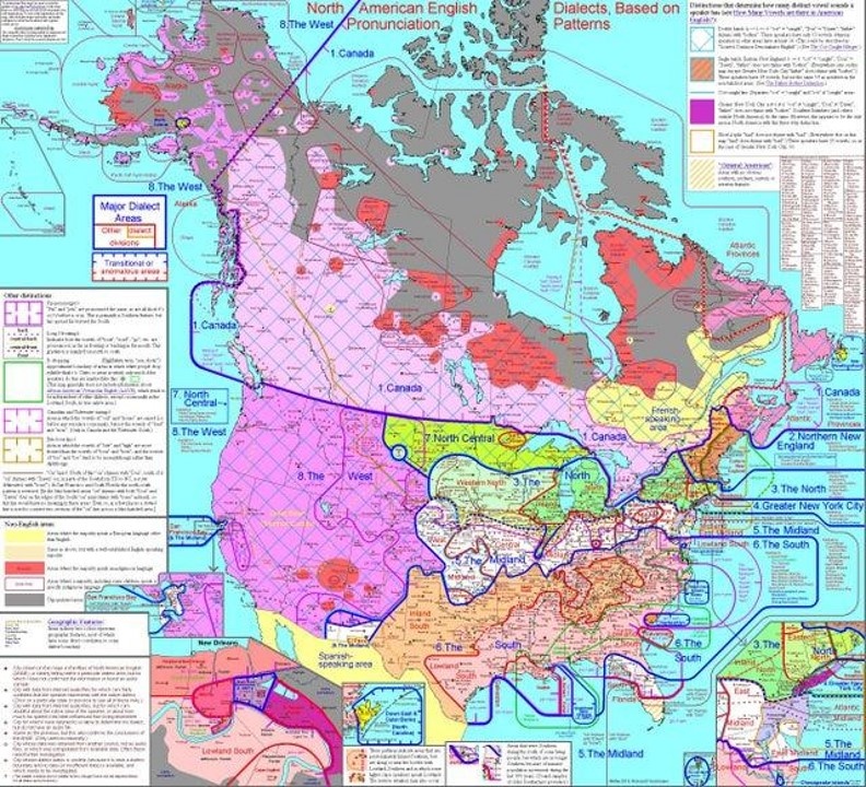
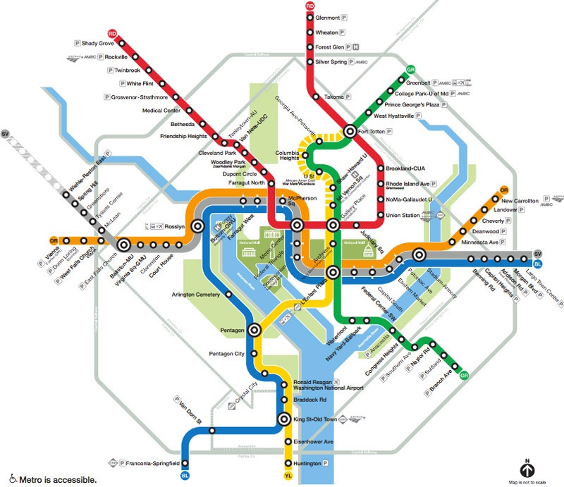
A Bad Map
Excellent example of a bad map showing really interesting information.
- Too much information
- Too many colors
- Text is way too small
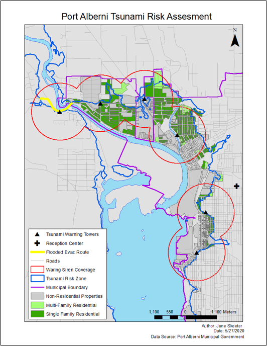
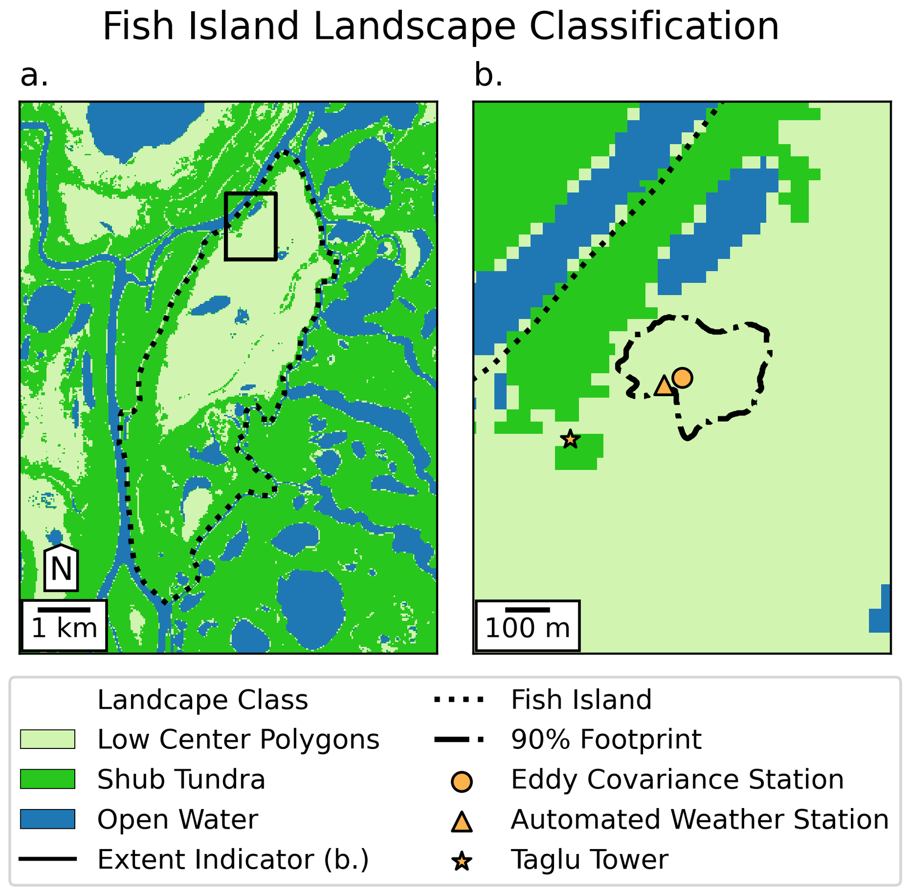
A Better Map
Cleaner, less complex presentation.
- Too much information
- Too many colors
- Text is way too small
Design Principals
The best maps can be interpreted quickly and easily.
- Title: Clear and to the point
- Content: Patterns are obvious, no “extra” information
Design Principals
The best maps can be interpreted quickly and easily.
- Content: Takes longer to read, but subject matter is more complex
- Minimizes “extra” information
- Simplifies geometry
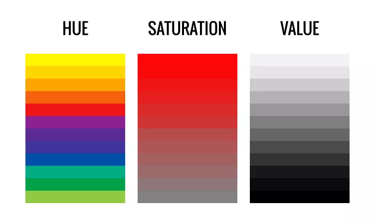
Color
The HSV scale describes three components of a color
- Hue: the dominant wavelength
- Typical association with the term “color”
- Saturation: the level of dominance
- All red or only a little?
- Value: the brightness / intensity
Color Choice
Qualitative
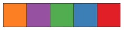
- Different hues,
- Fixed value and saturation
- Best for nominal scales
Sequential
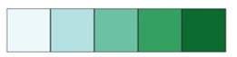
- Fixed hue
- Increasing value and saturation
- Best for ordinal & ratio scales
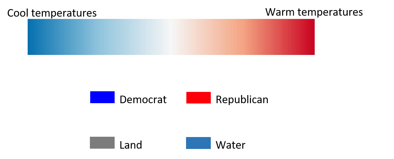
Diverging
- Opposing hues
- Diverging saturation
- Best for interval scales
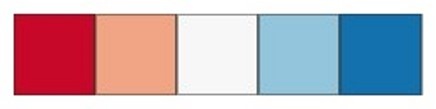
TopHat Question 2
This type of color map would be best suited for which variable?
- Land use (Forest, Agriculture, Urban, etc.)
- Temperatures (in Kelvin)
- Temperatures (in Celsius)
- Zoning Density (High, Medium, Low, etc.)
Color Choice
Some colors have implicit assumptions depending on the context.
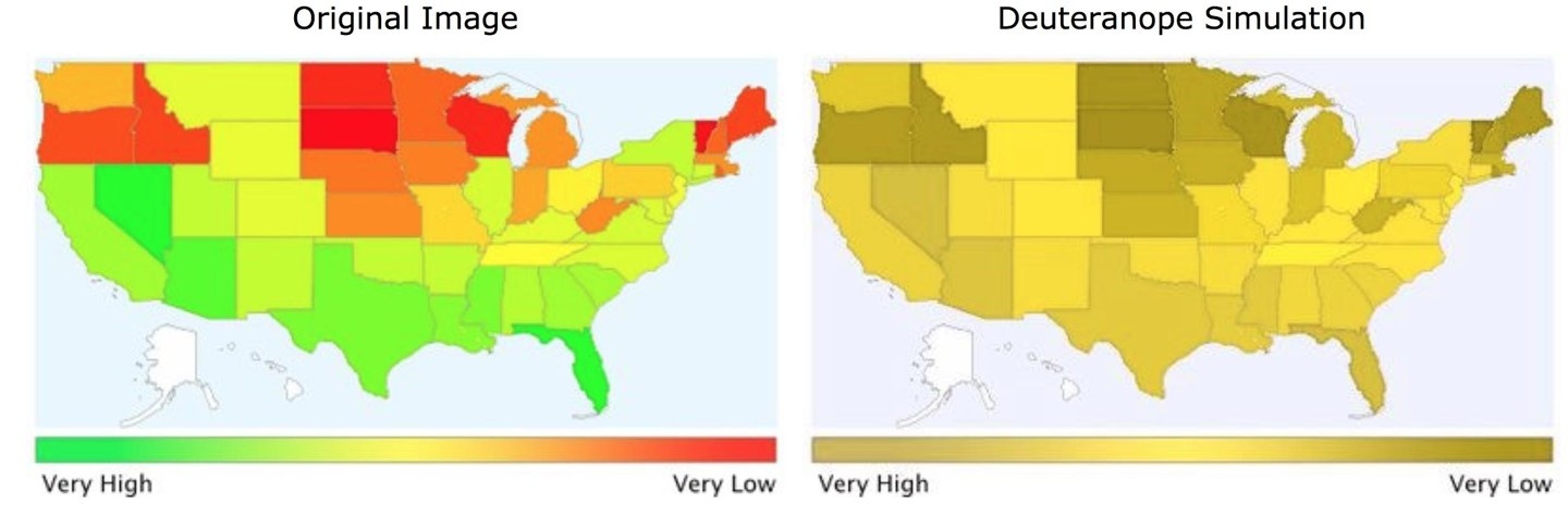
Color Accessibility
About 4.25% of people are colorblind, red-green is the most common. Color Brewer is a great resource.
Type of Phenomena?
Discrete:
- Points/lines/shapes
- Hues
Continuous:
- Surfaces, contour lines
- Saturation and value
What is the Measurement Scale?
Nominal:
- Dashes, shapes
- Different Hues (colors)
- Do Not choose colors or sizes that imply a difference in magnitude
What is the Measurement Scale?
Ordinal, Interval, or Ratio:
- Graduated symbols, line weights
- Different shades/intensities
- Do Not choose colors or shapes that imply a difference in category
Stylistic Guidelines
- North arrow not needed:
- At poles
- Familiar region
- Scale bar not needed:
- Familiar region
- Text can often suffice
- Can vary across the map
Stylistic Guidelines
- North arrow needed:
- Unfamiliar region
- North not up
- Scale needed:
- Unfamiliar region
- If navigation is goal
- Maps at different scales
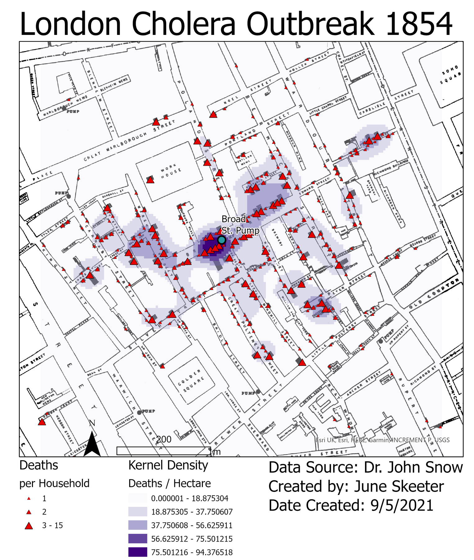
So Many Mistakes!!
- Poor use of map space
- Wasted white space
- Not centered
- Poor color choice
- Not colorblind friendly

So Many Mistakes!!
- Not all map elements are visible
- Text/font issues
- North arrow
- Placement
- Size & style
- Scale bar
- Wrong units!
So Many Mistakes!!
- Legend issues
- Avoid unnecessary text
- Don’t title it Legend
- Make sure entries are meaningful
- Get rid of underscores
- Avoid unnecessary text
So Many Mistakes!!
- No name / affiliation, date, or data source
- Be transparent, readers deserve to know:
- Who made the map?
- When was the map made?
- Where did relevant data come from?
- Be transparent, readers deserve to know:
Cleaner Presentation
- Area of interest takes up most of the map space
- Name, affiliation, source
- More meaningful legend entries
- Proper sizing/placement of map elements
- More pleasing, accessible color choices