Table of contents
Visualizing Vector Data & Plotting Relationships
These Census data are in Vector format. A key advantage of Vector Data is that we can have multiple attributes associated with each entity (point/line/polygon). Here, we are interested in three variables: Population (total residents), Housing (monthly rent), and Income (annual total).
1 Symbolize your census data by population.
- Set the Field to Population
- Change the symbology for Van_DA_2016 to Graduated Colors
- Explore how the different classification schemes influence the way the classified layer looks on the map
2 Make a Histogram of Population.
- Set the number to population
- Make sure the mean, median, and standard deviations are all shown on the Histogram.
3 Create a chart income vs. housing.
- Right click Van_DA_2016 and click Create Chart > Scatter Plot.
- In the chart properties tab set:
- X-axis: Income
- Y-axis: Housing
- Make sure “Show linear trend” is checked to display a regression line on your chart.
4 Note the zero values on the X & Y Axes. Stats Canada “suppresses” data when they don’t get enough responses to a census question. No house in Vancouver is worth $0. We need to exclude the zeros so they don’t skew our results
- In the Map tab, click Select by Attribute, select for “Housing” greater than 0 And “Income” greater than 0.
- Select by Attribute allows us to select rows/objects with a certain attribute.
- It relies on something called a Structured Query Language (SQL).
- We are selecting all rows “Where” our conditions are met.
- You can use the And/Or commands to combine querries.
- And: Selects whre All statements are true
- Or: Selects whre Any statements are true
A Note on Linear Regression.
A regression line is also know as a “line of best fit”. Linear regression assumes a linear relationship between some an independent variable (e.g. Income) and a dependent variable (eg. Housing). This is the simplest form of regression is know as Simple Linear Regression. In this model, the dependent variable Y is influenced by the independent variable X proportional to the slope m. If m = 1 means a 1:1 relationship between X & Y, m = 2 would mean Y increases by 2 units for every 1 unit increase in X, m = 0.5 would mean Y increases by 1/2 unit for every 1 unit increase in X. The intercept b accounts for an offset (bias) in the model.
\[Y=mX + b\]- Any deviations from this linear relationship are “errors”. That is, all the other variability that cannot be explained by the model. Housing cost is impacted by many factors (eg. scarcity) that aren’t as easy to capture with census data alone.
- In the example below for Van_DA_2016 (before excluding zeros), M = 0.0123 and b = 660.1, which means at $0 income, rent is $660.1. And for every $100 increase in income, rent goes up $1.23.
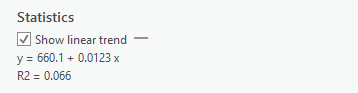
The R2 score, is known as the coefficient of determination. It is a measure of how well a model fits the data. It ranges from 0 to 1, with 0 representing “no fit” and 1 representing a “perfect fit”.
- This table shows how we assess the strength of a relationships indicated by the R2 statistics. In the example above, there is no strong relationship.
| R2 | Relationship |
|---|---|
| <0.3 | Very Weak |
| 0.3 - 0.5 | Weak |
| 0.5 - 0.7 | Moderate |
| >0.7 | Strong |
Comparing CTs to DAs
Repeat the steps above for the VanCMA_CT_2016 layer. Don’t forget to exclude the zeros on your scatter plot. Note there are fewer zeros overall. Think about why that might be. Hint look at the population of CTs compared to DAs
Visualizing and Classifying Raster Data
These NDVI data are in Raster format. An important caveat of raster data layers is they can only have one value per cell. However, they are useful because they allow us to represent continuous phenomena (i.e. vegetation health) as a simple image.
Create a Histogram
To get a feel for the distribution of NDVI values in the dataset, we’re going to plot them in a histogram to aid our visual inspection of the NDVI data.
1 Create a chart showing the count of cells by NDVI values.
- A histogram represents a distribution by grouping the data into bins (ranges), and plotting the count of values (eg. raster cells) for by bin.
- Change the bin number to see how changing the size of the bins, impacts how you perceive the data. Try 10, then try 50.
Use The Natural Breaks Classification
2 Search for the Reclassify tool in the geoprocessing pane. Use the projected NDVI layer as the input.
- Click classify to set the classification scheme. Set the method to Natural Breaks and the number of classes to 3.
- We talked about the Natural Breaks Classification in Module 3.
- It is designed to automatically find an “optimal” fit to a dataset.
- We can use it to group the NDVI values into three classes:
- 1: Water/Urban (lowest values)
- 2: Medium Density Residential (middle values)
- 3: Green Vegetation (highest values)
Change the Base Map
To help inspect the NDVI classification, we can change the base map and look at a satellite image layer.
- On the Map tab click “Basemap” and choose Imagery
- Toggle the NDVI Layer and classified image on and off to see how the NDVI values correspond to green vegetation on the visible imagery base map layer.